Padronče
- UX Research
- Brand Strategy
- Visual Identity
- Motion Design
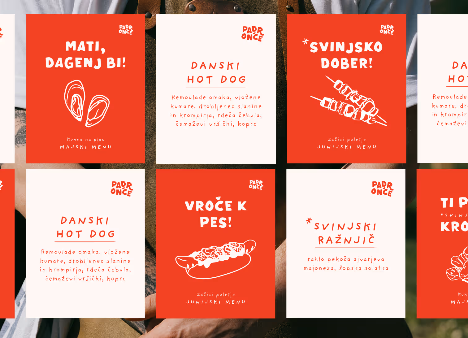
- Social Media
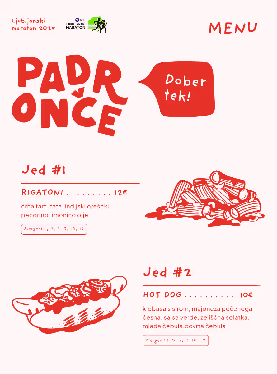
- Brand Printables
Context
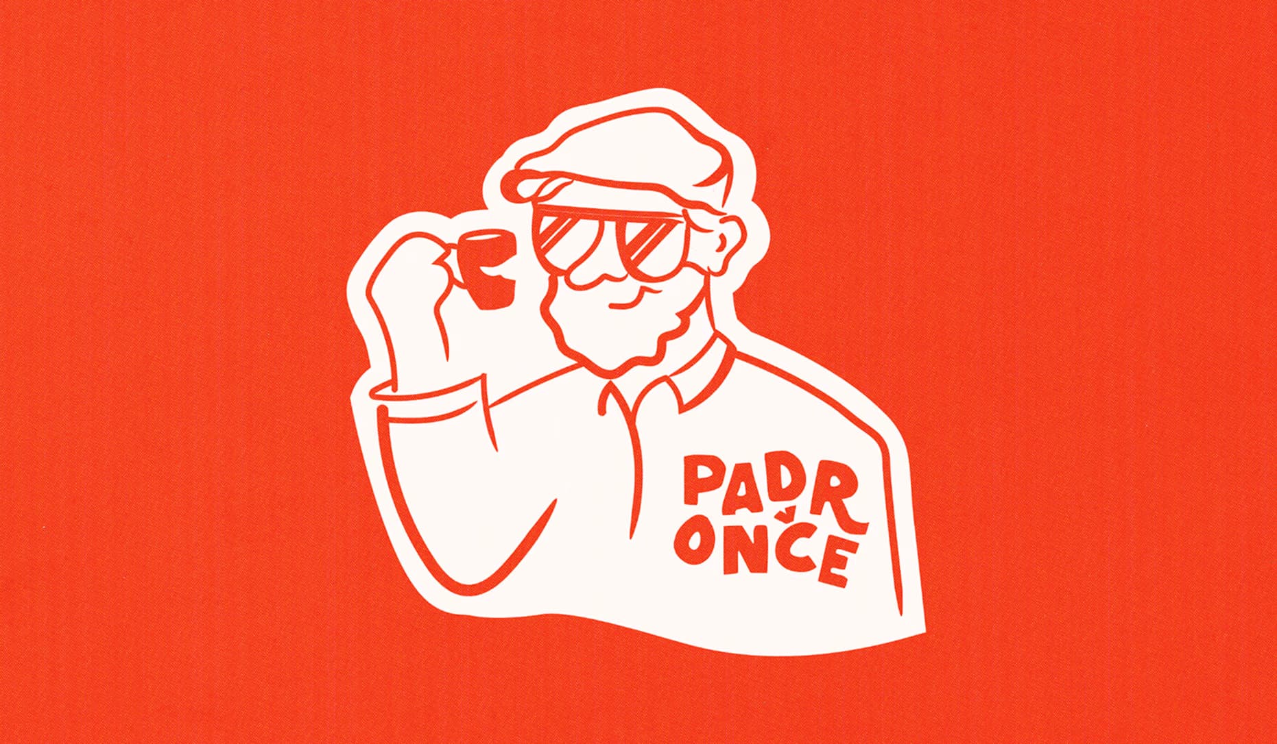
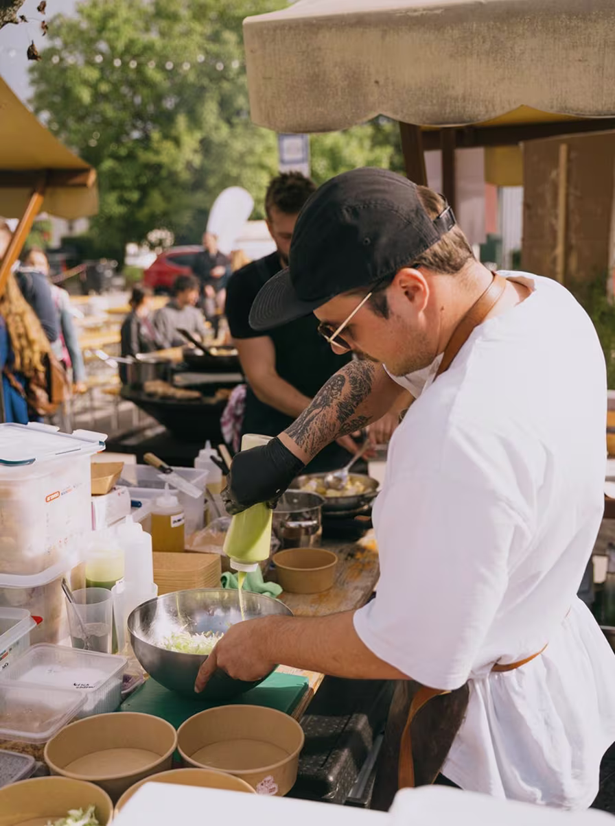
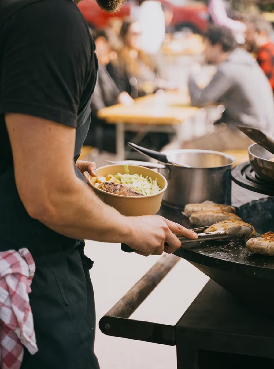
Martin and Žan are two friends and chefs who brought to life the idea of a pop-up street-food stand offering a modern, fresh take on familiar flavours. The name Padronče pays tribute to Martin's grandfather's nickname, who was an ethnologist and art historian who carried out excavations in the Slovenian Alps. Through the brand, they aim to introduce a youthful, bold energy to an otherwise traditionally rooted food scene.
Project Idea & Execution
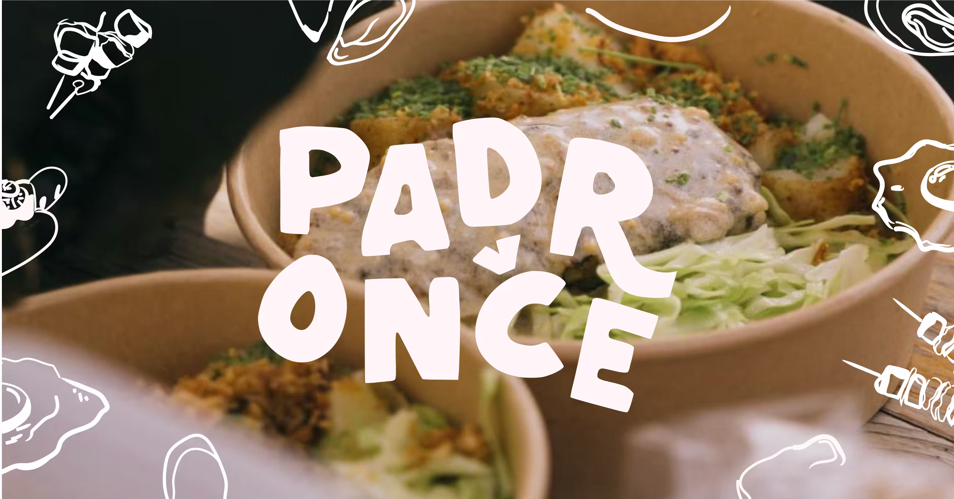
Padronče captures a youthful, playful spirit through bold colours, funky typography, and a touch of humour. Illustrations of "excavated" plates, mugs, and cutlery offer a modern twist on traditional objects. At its heart is Padronče himself, the logo figure with a mischievous smirk, bringing the brand to life and embodying its passion for great food, playfulness, and human connection.