
POP Matcha
- UX Research
- Visual Direction
- Web Design
- Web Development
Context
POP Matcha is a Slovenian matcha brand with a playful and unconventional take on the traditional wellness space. Created around high-quality ceremonial matcha, the brand combines a strong visual identity with a light, humorous and slightly cheeky personality. Its second matcha drop introduced a new packaging direction, opening up an opportunity to further expand the brand's visual world in digital.
Project Idea & Execution
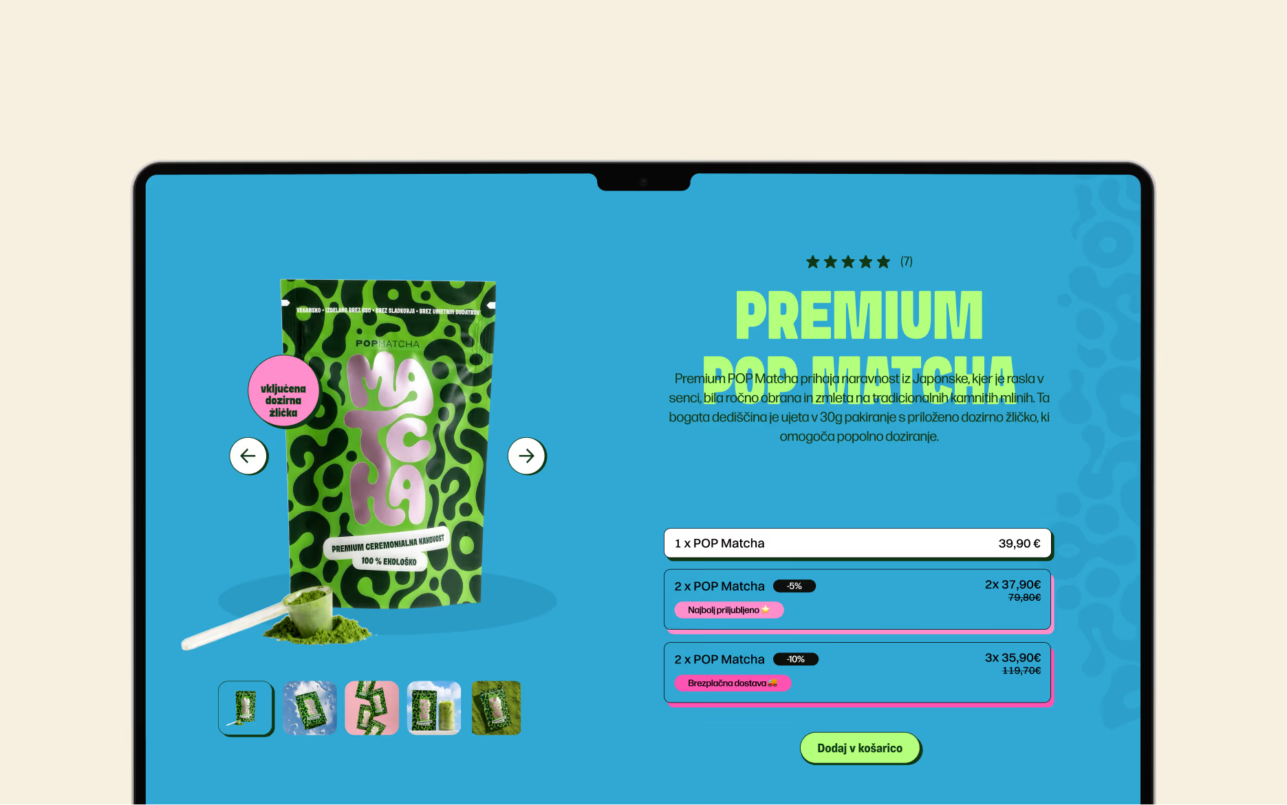
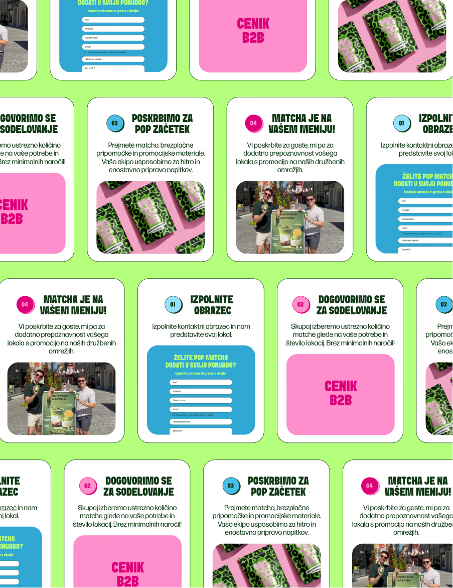
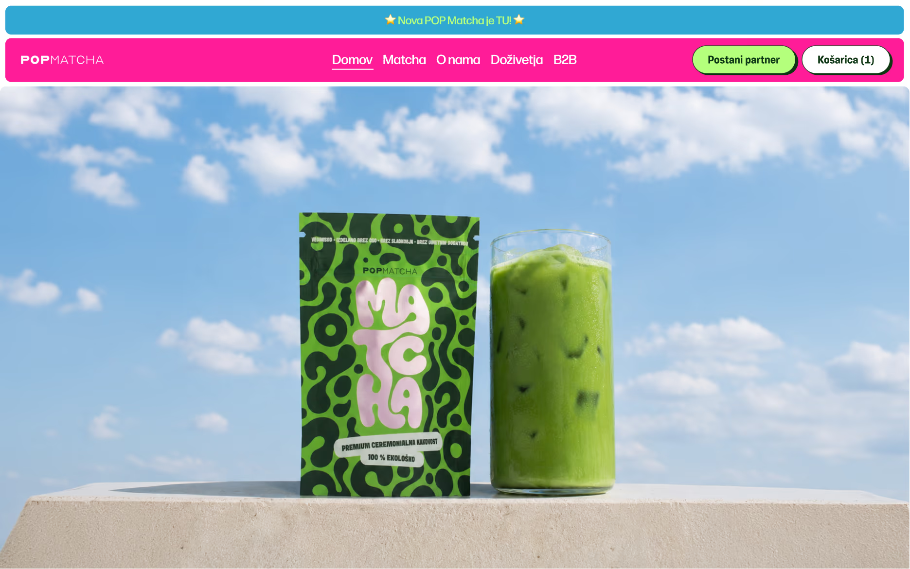
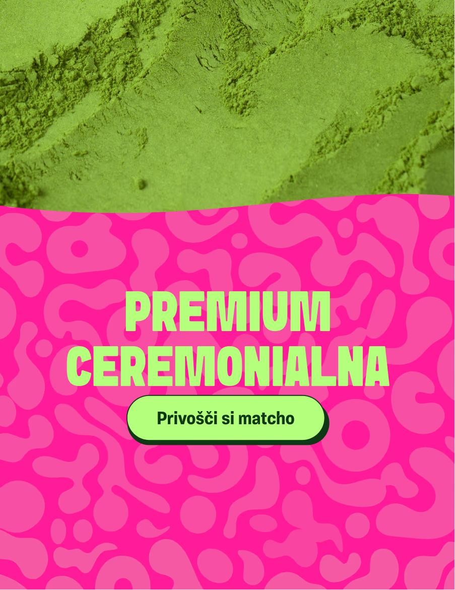
The packaging became the starting point for the website's visual direction. We carried over its expressive patterns and bold typography, then added bright pinks, greens and blues to highlight the playful character of the drop. The website and online store were designed and developed as a bold but simple digital experience, keeping the product easy to discover and purchase while extending the same visual language across the rest of the brand.